Designer-Approved Paint Colors That Make Small Rooms Feel Larger and Brighter
There’s a particular kind of frustration that comes with decorating a small room. You’ve got the furniture sorted, the textiles picked out, and then you stare at four bare walls and think: now what? The wrong paint color can make a compact bedroom feel like a shoebox. The right one can transform a narrow hallway into something that feels almost cinematic. That’s the quiet, underestimated power of paint.
Here’s the good news: top interior designers don’t default to blinding white and call it a day. They reach for specific shades of soft mineral greens, blushed off-whites, hazy blues, and occasionally something moody and dramatic that do the heavy lifting of making small spaces feel intentional, layered, and genuinely larger. Below, you’ll find their go-to best paint colors for small modern house, along with ten expert tips and everything you need to choose wisely.
Designer-Approved Paint Picks for Small Spaces
1. Benjamin Moore Pale Oak (OC-20): A Warm Neutral That Never Feels Flat
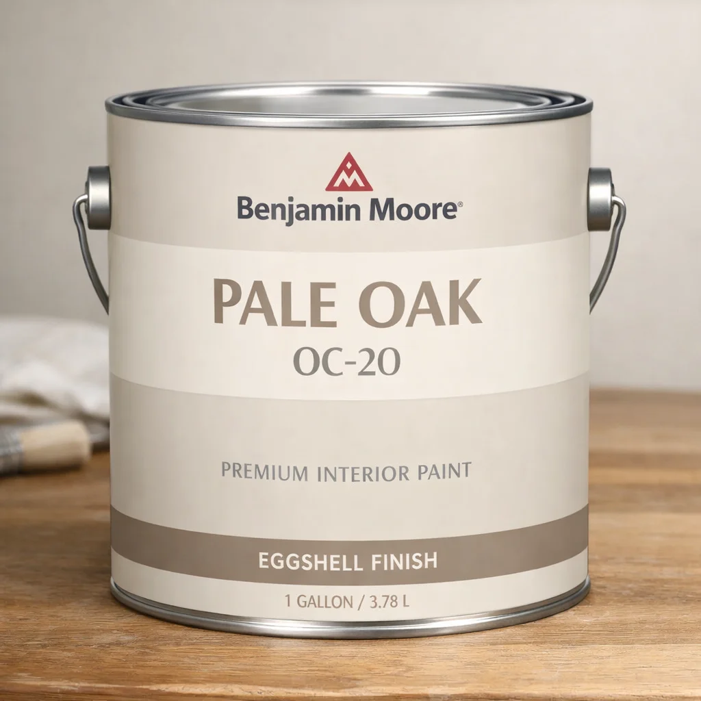
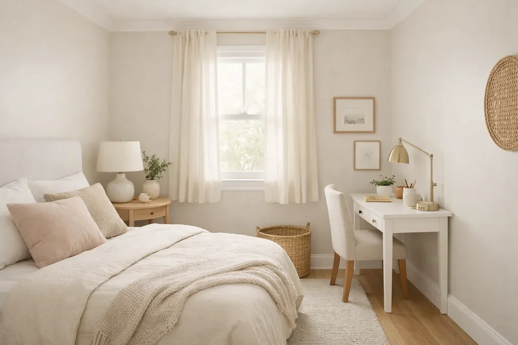
A Brooklyn-based residential designer describes Pale Oak as “the color that makes every client ask why their room looks bigger after just one coat.” It’s a creamy, biscuit-toned neutral with the faintest blush undertone warm enough to feel inviting, light enough to reflect natural light beautifully. In small room paint ideas, this one earns its place because it works across north- and south-facing rooms alike.
One‑gallon can of Benjamin Moore “Pale Oak OC‑20” interior paint typically costs about $60.99 USD when purchased directly from Benjamin Moore retailers. Smaller sample sizes (color chips or peel‑and‑stick swatches) range from $5.99 to $7.99 USD depending on the store and finish options.
Try it in: A compact bedroom or a studio apartment where you want warmth without visual noise.
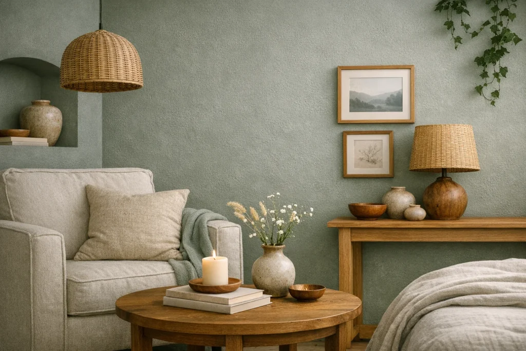
2. Sherwin-Williams Comfort Gray (SW 6205): The Soft Sage That Opens Up a Room
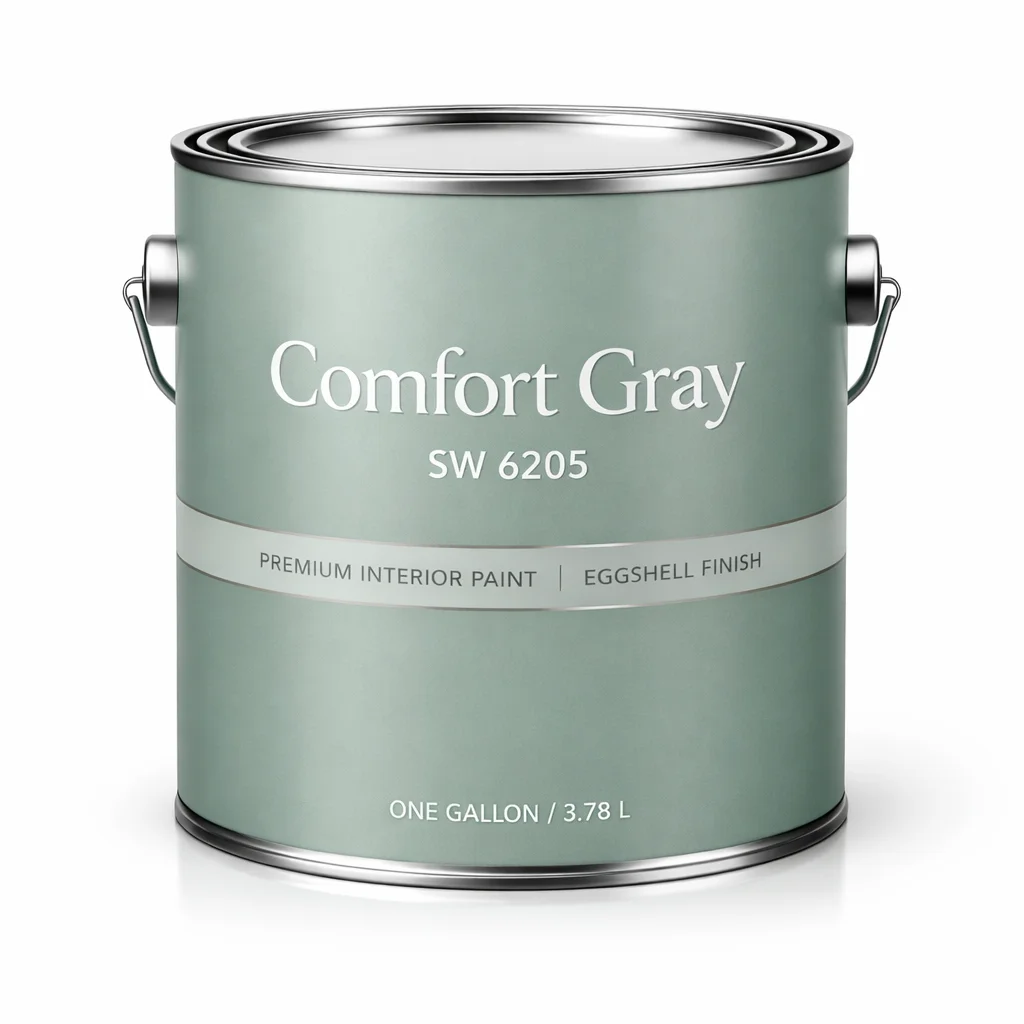
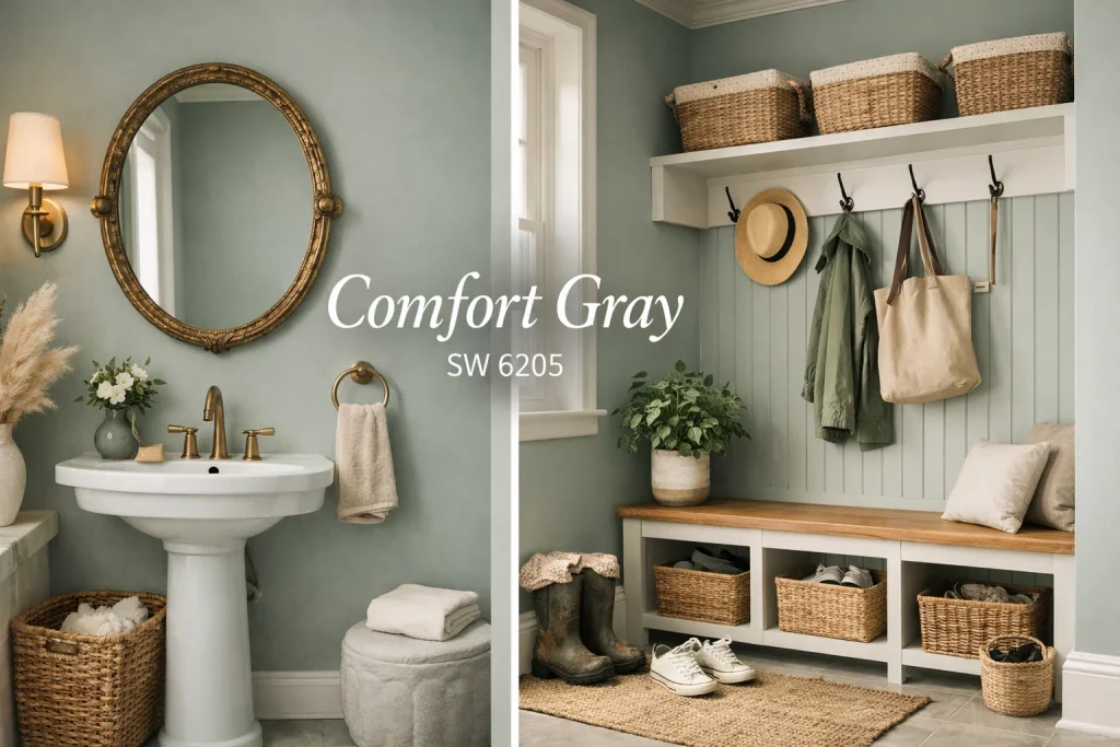
“I’ve used Comfort Gray in more powder rooms and mudrooms than I can count,” says a Chicago-based interior designer with a focus on compact urban spaces. Despite its name, this color reads as a hushed, grey-green sage not cold, not clinical. It blurs the line between wall and nature, making the eye travel and the room breathe.
A gallon of Sherwin‑Williams Comfort Gray (SW 6205) interior paint typically costs between $45 and $75 USD, depending on the finish and store promotions. Smaller peel‑and‑stick samples are available for $6.95 to $9.95 USD.
Try it in: A small bathroom or laundry room where you want a spa-like softness without sacrificing brightness.
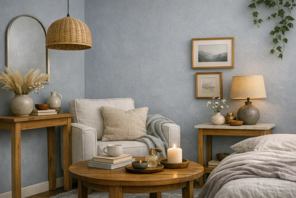
3. Farrow & Ball Borrowed Light (No. 235): The Palest Blue You’ll Ever Love
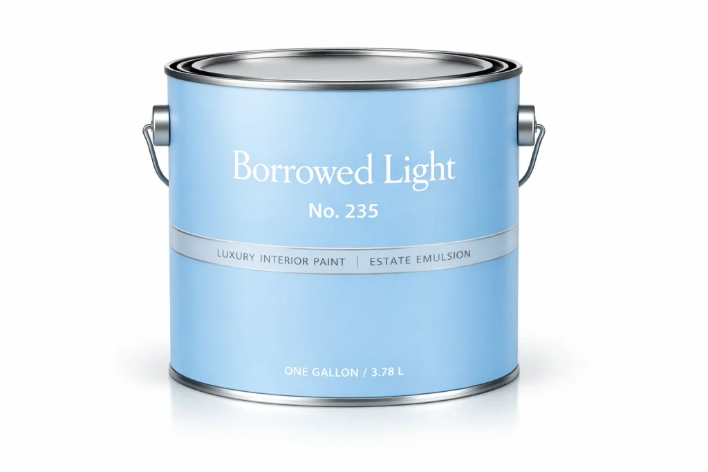
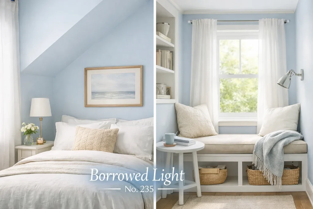
Borrowed Light is the kind of color that looks almost white on the chip but transforms into something quietly celestial on the wall. A London-trained designer who relocated to Los Angeles puts it plainly: “It’s the color of a morning sky through gauze. In a small space, it lifts the ceiling and makes you forget the room isn’t twice as big.” Among the best paint colors for small spaces, this one is an outlier; it works even in north-facing rooms with limited sunlight.
Farrow & Ball’s Borrowed Light (No. 235) paint typically costs between $92 and $175 USD per gallon, depending on the finish and retailer.
Try it in: A reading nook, a small guest bedroom, or an entire studio apartment.
4. Behr Cracked Wheat (N260-2): The Understated Earthy Tone Making a Comeback
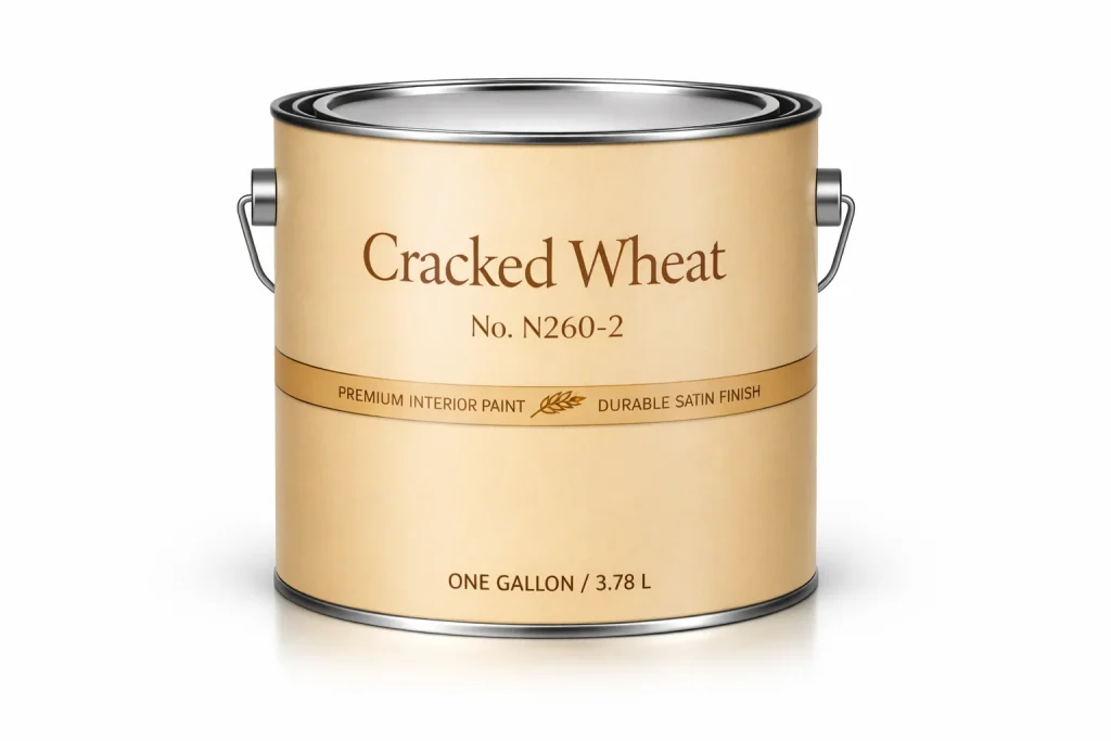
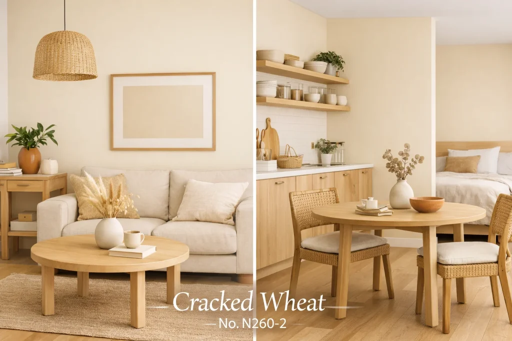
A minimalist designer based in Austin, Texas, calls Cracked Wheat her “stealth weapon for open-plan micro-apartments.” It’s a pale, slightly sandy off-white with a hint of golden ochre earthy enough to feel grounded, light enough to act as a near-neutral. It pairs effortlessly with natural wood, rattan, linen, and terracotta accents.
Behr Cracked Wheat (N260‑2) paint typically costs between $42 and $65 USD per gallon, depending on the finish and retailer.
Try it in: A small living room or combined kitchen-diner where you want a cohesive, textural warmth.
5. Portola Paints Roman Clay in Dune: Texture That Creates Depth
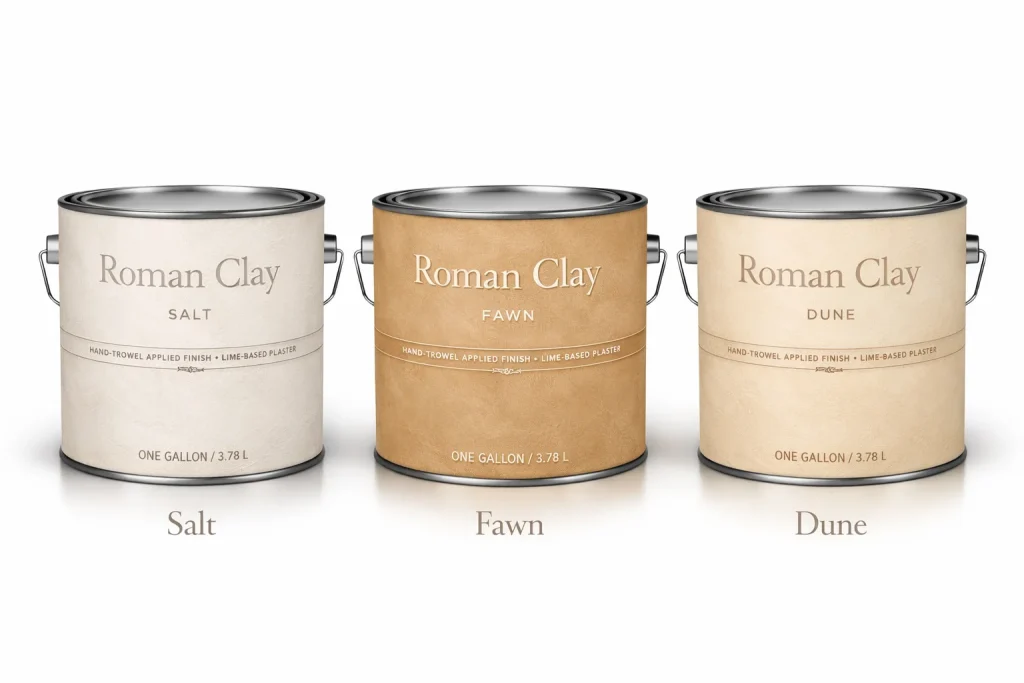
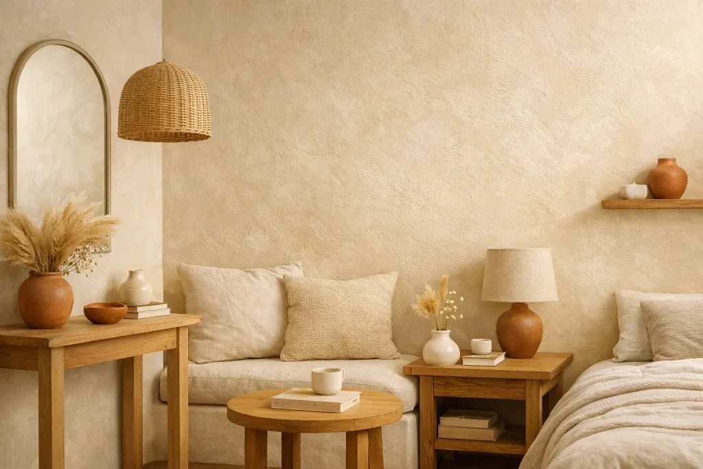
Portola’s Roman Clay finish deserves a spotlight of its own. Dune is a pale, sun-warmed ivory that, when applied as a textured Roman clay, creates subtle dimensional layering on the wall. A San Francisco studio founder who specializes in small-footprint homes says: “The texture does what a flat coat of paint can’t; it makes you feel like the wall has depth, so the room doesn’t feel hemmed in.” It’s one of the most interesting small room paint ideas available today.
Try it in: A feature wall in a compact living room, or an entire powder room for a tactile, boutique-hotel effect.
6. Benjamin Moore Mount Saint Anne (2148-40): A Barely-There Green for Modern Interiors
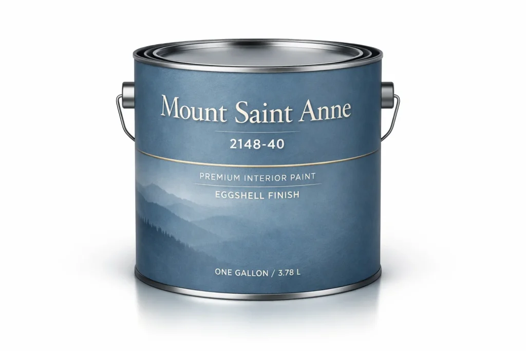
This muted, sage-adjacent green sits at the intersection of nature and neutrality. It’s not loud, not trendy; it simply makes a room feel as though it exists somewhere slightly magical. A New York-based designer who works predominantly on co-op apartments says she recommends it “every time a client wants something other than white, but is nervous about color.” Among designer paint picks, it punches above its weight.
Try it in: A small home office, a dressing room, or a narrow hallway where you want color without drama.
7. Sherwin-Williams Indigo Batik (SW 7602): A Deep Blue That Creates a Cozy Cocoon
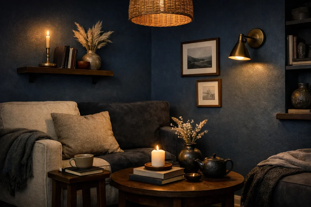
Here’s where things get interesting. Not every small room needs to feel larger. Sometimes a moody, rich color can make a compact space feel intentionally intimate. Indigo Batik is a deep, saturated navy with enough grey in it to avoid feeling loud. A minimalist designer based in Seattle describes it as “the color that makes a small room feel like it has a personality.”
Try it in: A powder room or a small home library where you’re leaning into the coziness rather than fighting it.
8. Farrow & Ball Peignoir (No. 286): The Dusty Blush With Sophisticated Edge
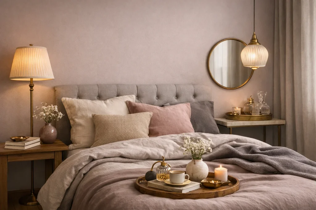
Peignoir is a grown-up pink barely there, almost lavender, with a quiet sophistication that makes a small bedroom feel like something from a boutique hotel. “It photographs beautifully and it lives beautifully,” says an interior stylist who works on compact London flats. The muted quality means it doesn’t overwhelm, while the warmth ensures the space never feels cold.
Try it in: A small primary bedroom, a dressing room, or a bijou nursery.
9. Behr Dusty Miller (790C-3): A Blue-Grey That Handles Any Lighting Condition
Dusty Miller is a versatile, cloud-soft blue-grey that shifts depending on the light warmer in the evening, cooler at midday. For small room paint ideas, it’s a reliable choice because it doesn’t require perfect natural light to look good. A Los Angeles studio founder who works on compact beach rentals calls it “a chameleon color; it just works, always.”
Try it in: A small living room, a studio apartment, or a narrow guest bedroom.
10. Benjamin Moore Hale Navy (HC-154): The Classic Dark That Doesn’t Shrink a Room (When Used Right)
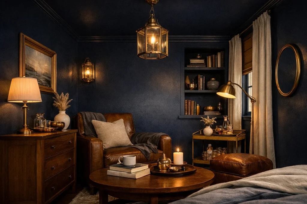
Counterintuitively, Hale Navy, one of the most iconic Benjamin Moore small room colors can make a small room feel expansive when used on all four walls and the ceiling. The trick, as a Connecticut-based designer explains, is “total immersion: when the boundaries disappear, the room stops feeling small and starts feeling like a destination.” It works especially well when paired with warm brass hardware and natural wood.
Try it in: A small dining room, a powder room, or a moody study.
How to Choose Paint Colors for Small Rooms: 10 Expert Tips
1. Don’t Default to Brilliant White
Stark white can actually make a small room feel harsher and more enclosed, especially under artificial light. Instead, reach for soft off-whites with warm or cool undertones creamy ivories, pale greiges, and milky whites feel airier and more sophisticated.
Try this: Sample Benjamin Moore Chantilly Lace or Behr Ultra Pure White alongside a warmer off-white like Pale Oak to see the difference in your specific lighting.
2. Use Tone-on-Tone Layering to Blur Boundaries
One of the most effective tricks for making a small room feel larger is painting walls, trim, and ceiling in different values of the same hue. The visual continuity prevents the eye from hitting a hard stop at every corner.
Try this: Choose a mid-tone for your walls, a lighter version of the same shade for trim, and the lightest version on the ceiling.
3. Embrace the “Fifth Wall”: Your Ceiling
The ceiling is one of the most underutilized design surfaces in a small room. Painting it a slightly lighter shade of your wall color, or even a complementary pale pastel, draws the eye upward and adds perceived height.
Try this: In a room with Comfort Gray walls, try Sherwin-Williams Spatial White on the ceiling for a seamless upward flow.
4. When to Go Dark and Dramatic
A deep, rich color on all walls including the ceiling can transform a small room into something intentional and cocooning rather than cramped. This works best when the room has a single, clear purpose (a dining room, a library, a powder room).
Try this: Commit fully. Painting only two walls dark often just makes a room look half-finished. Go all four walls plus the ceiling for the full effect.
5. Test Samples in Multiple Lighting Conditions
Paint colors shift dramatically from morning to afternoon to evening, and under natural versus artificial light. What looks like a warm ivory at noon might turn greenish under LED bulbs at night.
Try this: Apply large (at least A4) swatches directly on the wall and observe them at 8am, noon, 4pm, and after dark with your usual lighting switched on.
6. Make Narrow Hallways Feel Wider With the Right Technique
For a narrow hallway, painting the end wall a slightly deeper shade than the side walls creates a visual focal point that draws the eye forward, making the hall feel less like a corridor and more like a purposeful transition.
Try this: Paint side walls in Dusty Miller and the end wall in a deeper, related tone like Sherwin-Williams Misty (SW 6232).
7. Choose Off-Whites Based on Your Natural Light
Not all off-whites are created equal. A yellow-undertoned off-white like Cracked Wheat will feel cozy in a dim room but slightly dingy in a south-facing sun-drenched space. A cool off-white, like Farrow & Ball All White, suits brighter rooms without washing out.
Try this: Hold a paint chip against a sheet of white printer paper. The undertone green, pink, yellow, grey will become immediately obvious.
8. Create Accents That Expand Rather Than Shrink
An accent wall in a contrasting color often does the opposite of what’s intended in a small room: it draws attention to the size of that one wall rather than the depth of the space. Instead, use an accent in the form of a painted niche, a built-in bookcase, or an alcove.
Try this: Paint the interior of a built-in bookcase in Hale Navy while keeping surrounding walls neutral to create depth without closing in the room.
9. Use Earthy Tones for Grounded Warmth Without Heaviness
Modern earthy tones, dusty terracottas, warm taupes, sandy beiges have a grounding quality that makes a small room feel settled and designed rather than underdressed. They work especially well in rooms with natural materials like stone, wood, and linen.
Try this: Pair Cracked Wheat walls with unfinished oak floors and cream linen curtains for an effortlessly layered, warm small living room.
10. Be Bold in Low-Stakes Spaces
Powder rooms, closets, and small nooks are the perfect laboratories for bolder color experiments. Because you spend minimal time in them, a daring choice feels thrilling rather than exhausting and it’s easy to repaint if you change your mind.
Try this: Try Indigo Batik in a powder room with polished nickel fixtures and a statement mirror. The result will look like something out of an interior design magazine.
The Best Paint Products for Small Spaces
When it comes to finishes, matte and eggshell are almost always the right call for walls in small rooms. Flat finishes absorb light rather than bouncing it around, which reduces the visual busyness that makes compact spaces feel chaotic. Eggshell adds just enough sheen to be wipeable, important in high-traffic areas like hallways.
For textured alternatives, Portola Paints’ Roman Clay and limewash products offer an artisanal depth that flat paints can’t replicate. Applied in thin, overlapping layers, they create a dimensional surface that adds visual interest without pattern or color drama.
For bathrooms and kitchens where moisture is a concern, a satin or semi-gloss finish is more practical. Benjamin Moore’s Aura Bath & Spa line is specifically formulated for humid environments and resists mildew without sacrificing color accuracy. Sherwin-Williams’ Emerald Interior is another premium option known for excellent hide, rich pigmentation, and a durable finish that holds up to regular cleaning, ideal for hallways, kids’ rooms, and small kitchens.
Conclusion
Painting a small room is one of the most rewarding design decisions you can make. It costs far less than a renovation, yet the impact feels monumental. The right color doesn’t just decorate the walls; it reshapes how you experience the space, turning a cramped alcove into a cozy library, a tiny powder room into a jewel box, or a narrow hallway into a light-filled gallery. As the designers we’ve featured prove, there are no rigid rules: airy off-whites can expand, moody hues can embrace, and earthy mid-tones can wrap a room in quiet luxury. The key is to choose a shade that resonates with how you want to feel in the space.
FAQs:
Q1. What is the best color to make a small room look bigger?
Soft, light-reflecting neutrals like pale greens, warm off-whites, and hazy blues work best. They avoid visual competition and let the eye travel freely across the space.
Q2. Should I paint a small room dark or light?
Light colors open a room up; dark colors make it feel intentionally cozy. Both work the key is committing fully rather than doing a half-hearted mix of both.
Q3. Which wall should I paint darker in a small room?
The back wall, directly opposite the entry point, is your best candidate. It creates depth and draws the eye forward, making the room feel longer than it is.
Q4. Is an accent wall a good idea in a small space?
Only if done tonally a slightly deeper shade of your wall color rather than a dramatic contrast. A bold contrasting wall often highlights how small the room is, not how interesting it looks.
Q5. How do I test paint colors for a small room?
Buy sample pots, paint generous swatches directly onto the wall, and observe them morning, afternoon, and evening. Never judge a color from a chip, lighting changes everything.

As an admin, with a passion for transforming spaces and a sharp eye for design trends, I created Interior Design Style Quiz to help homeowners make confident, informed decisions about their homes from the curb all the way inside.